Brief Summary:
Sketchy Beans is a "creatives coffee shop" - a co-working space for creatives that doubles up as a coffee roaster & cafe. I want "Sketchy" to relate to my hand-drawn creative process, and "beans" is a subtle nod to the coffee bean. The business aims to offer creatives a safe and creative co-working space while feeding their bodies with kick-ass coffee. What makes this business unique is its dual nature; this isn't a place for socializing but more of a place of Zen that allows you to focus. Here are a few adjectives that would best describe my brand: Approachable, welcoming, unique, different, honest, mindful, calming, super creative, edgy & energized, fun with focus.
Mood Board:
I explored James's mood board and took pieces from it that I wanted to explore further within my design. I then returned to the brief to see how I could elaborate on the mood board to ensure I captured the essence of the direction he wanted the creative coffee shop to go in.
Exploration:
To create the logo, I used a more hand-drawn approach to stick to the brand and guidelines of the brief.
I initially referenced the Mood board James curated and was instantly drawn to the Dark and Stormy Illustration, more precisely, the inked stroke of the rain. At that point, I decided to run with that element of a thick-to-thin stroked line to develop the logotype. The other segment I wanted to incorporate that stuck out in the brief was the statement of a "subtle nod to the coffee bean." So, I created a loose illustrative approach to a coffee bean shape, and though I knew the form was reasonably simple, there was a lot of room to add personality. I also used this opportunity to create an iconic symbol that would allow the brand to be easily recognizable.
I initially referenced the Mood board James curated and was instantly drawn to the Dark and Stormy Illustration, more precisely, the inked stroke of the rain. At that point, I decided to run with that element of a thick-to-thin stroked line to develop the logotype. The other segment I wanted to incorporate that stuck out in the brief was the statement of a "subtle nod to the coffee bean." So, I created a loose illustrative approach to a coffee bean shape, and though I knew the form was reasonably simple, there was a lot of room to add personality. I also used this opportunity to create an iconic symbol that would allow the brand to be easily recognizable.
Color Palette:
Based on the brief, I chose a muted natural color palette influenced by the idea of Zen. When I thought about Zen, I was drawn to the concept of a Japanese dry garden and the play of colors between sand, stones, and greenery. The color palette and idea could then be implemented through interior design statements to boost moods, reduce stress, increase productivity, and inspire creativity.
Patterns:
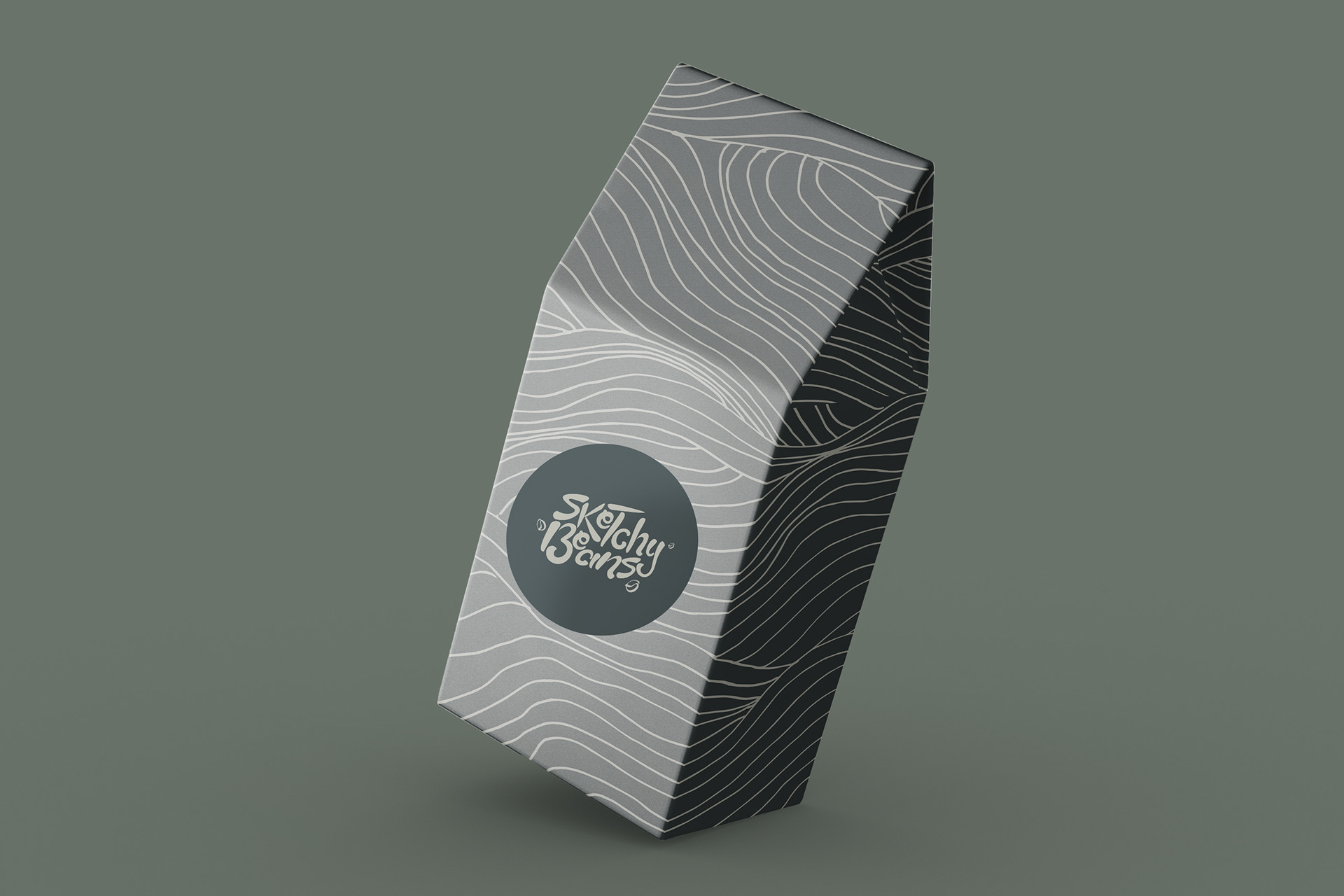
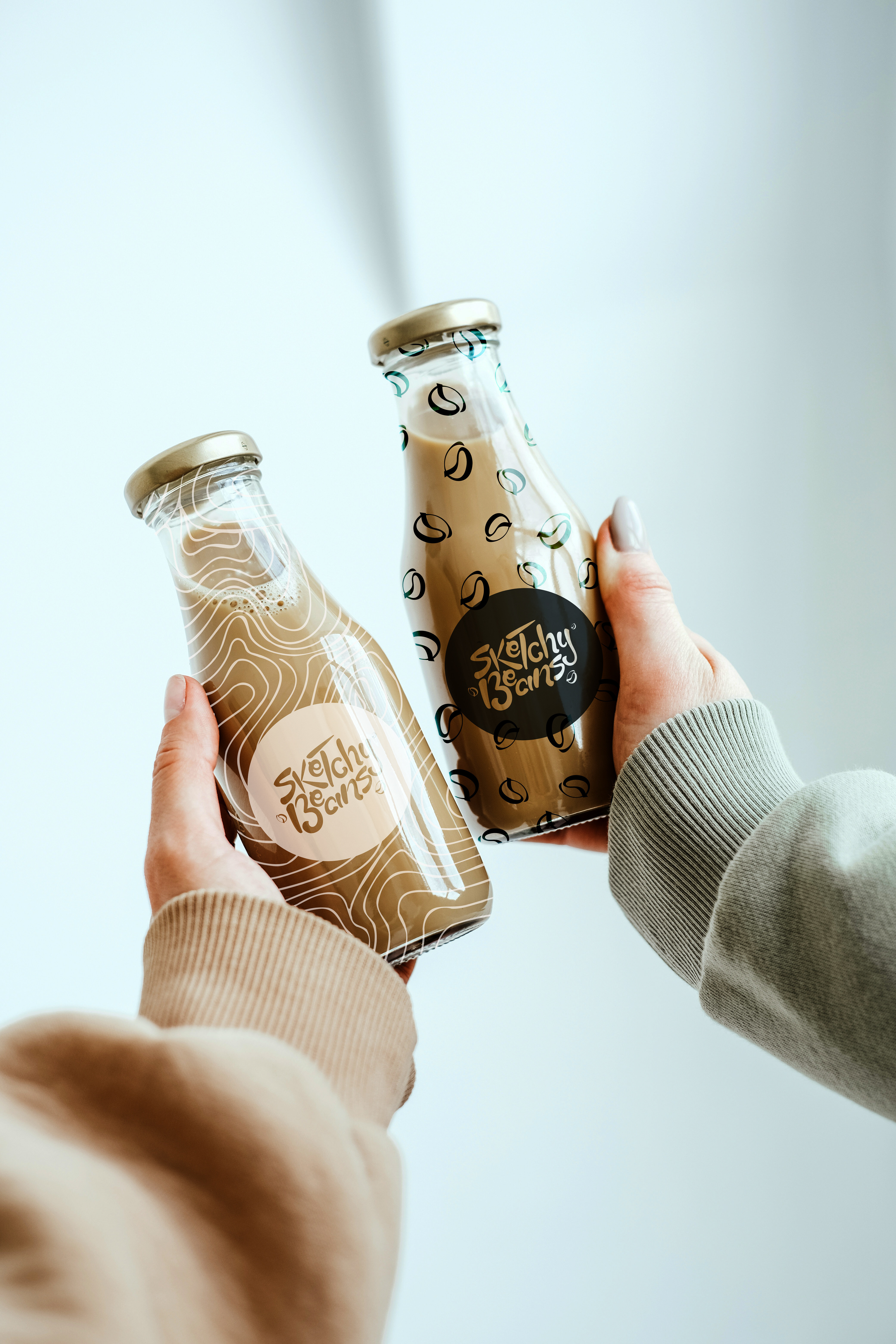
I used the beans and the idea of creating line art in the sand to create the patterns.
Mockups:
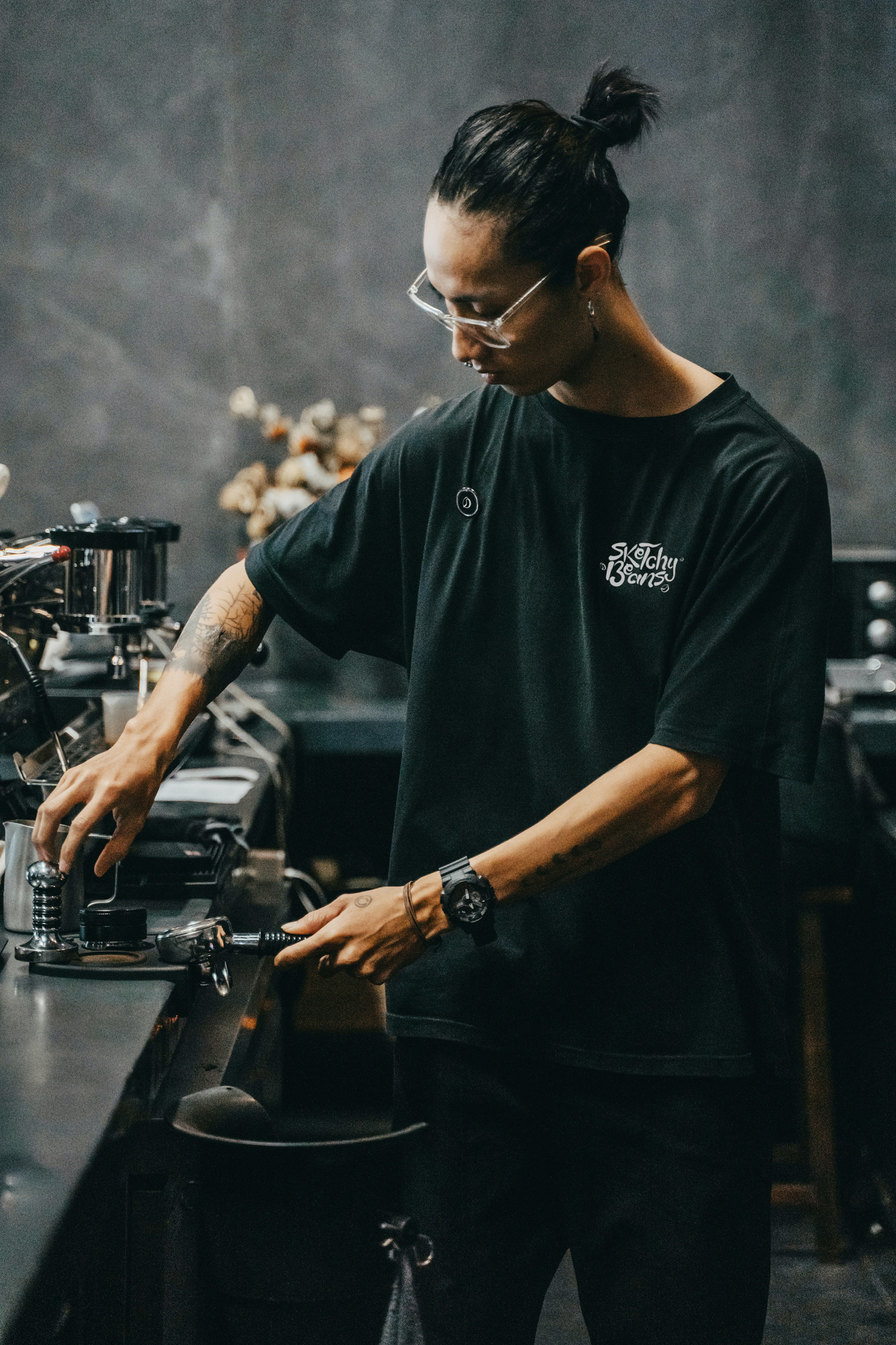
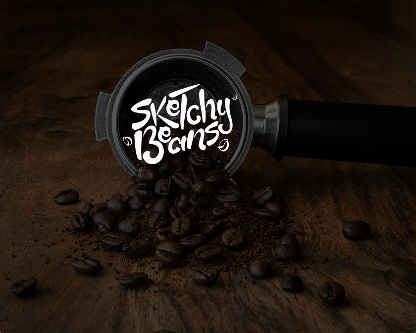
Creating the Mockups was more challenging than I initially thought, but I still had a lot of fun.
Had such a blast creating this logo for James!